Thursday, May 24, 2007

10 tips for Office Evacuation Usability

Just yesterday our office in Manhattan performed a full building (all 7 flights) evacuation and I took that opportunity to review fellow co-workers as we exited the building and organized in our pre-planned meeting spot.

Previous to this evacuation our local fire marshal explained how to exit the building, utilizing the stairs, staying to one side to let firemen up and such, and to group ourselves to keep an accurate headcount. All of which seems perfectly reasonable in abstract. From this I have produced 10 usability tips.

Tip 1: Stay to the right
While it was stressed in our evacuation meeting there were still some people who insisted they were better than the rest and walked down the left side. While they were few and far between it's better to practice safe habits before the actual event, so stay to right.

Tip 2: Know where you are
When egressing the building there are very few indicators of what floor you are on, these indicators are on the backs of the doors about head height. Unfortunately these doors are open and there are heads in the way of seeing where you are. It would be much better to have large day-glow numbers on the landings of the floor, preferably 4 foot wide so they are easily visible.

Tip 3: Don't trip
Even though this was just a drill there was one poor soul who tripped down a few stairs. Luckily he caught himself on the handrail and was un-injured but it's a word to the wise to always use the handrails. This not only keeps you nice and tight to the right, but it helps keep you from injury. Reflective tape on the steps would also help.

Tip 4: Know how to help
Building on tip #3 raises the possibility of someone getting injured. This is one item that is not generally covered. If someone is injured, and you need to leave them behind it would be a really good idea to know where this person is to send help to. The big numbers from Tip #2 would be a big help. If you need to get someone out it would be a good idea to familiarize yourself with the fireman's carry. This is something you learn as part of boy scouts doing first aid. There are many ways to do it, so knowing how will keep you from injury if you need to do it.

Tip 5: Don't clog the exits
Get away from the building. One of the reasons our fire marshal has set up meeting spots away from the building is to avoid congestion at the exits. Unfortunately, people flock like penguins seeking protection and as a result now block these meeting area entrances. If you are a leader move your people from the entrances.

Tip 6: Keep track of everyone
One of the items we tried when leaving was taking down a set of people in smaller groups to keep track of those on the floor and in the building. This single person approach does not work. I would suggest having a line leader and a sheep herder. The line leader goes first and leads the group down, while the sheep herder knows how many people are in front of him (in the group) and acts as a backstop for when other groups filter in from other floors.

Tip 7: Stay together
While we egressed there were some folks that though they were too cool for school and decided to make their way somewhere else. This is not only a problem for the line leader (and sheep Herder) but it prevents the overall persons in charge from getting an accurate count of people in the building. While it is better to know how many people have left I would maintain it's more important to know that everyone in your group got out. Following the sheep herder model will help get the small groups out.

Tip 8: Use a new exit
Another helpful scout tip is to know two exits from any location and know of any crossover floors (floors that have access to multiple staircases). If you do a building evacuation test, tell your folks to find a new staircase than the one they use, or better yet, post someone in front of the most popular one and say, "this exit is blocked by fire, go find another one", forcing them to think.

Crossover floors would also be a great thing to stencil to the wall of the evacuation stairs.

Tip 9: Visible means safe
For drills and where possible for evacuations you should train the persons in charge to wear their special hats/shirts etc. If you are a fire warden, wear the fire warden hat. This will make it easier for people to find you. When choosing a line leader, choose someone with a colorful shirt, or dress, anything out of the ordinary to jog your memory in a time of crisis.

Tip 10: Recap Afterwards
Like any project it pays to get together the next day and re-cap how you think it went to see if in the future you can do anything better. Drills should be treated as close to the real thing as possible, if people make a game or joke out if it they won't know what to do when a situation occurs.

The 10 minutes may lead to better and safer evacuations.

Monday, May 21, 2007

Do you know how to use a urinal?

The usability of urinals was never really very high on my list of topics. In fact I never thought about it very much to begin with until I saw the attached sign.

A urinal is one of those devices that you learn to use at a very early age. It only contains two areas of concern – The input and the output.

If you have ever seen older urinals one of the first things you notice is that they go from floor to mid chest, this was done, I suppose, to make it perfectly clear as to the intended input and to minimize backsplash, making clean up easier.

The newer urinals are more compact and leave tile space below, like in our example. If the urinal was not as ubiquitous one might challenge this design change as folly, inviting input other than desired. But since the utilization of urinal technology would have begun at an early age, this error should not be commonplace (unless the participant happens to be very drunk).

This situation has similarities to young people today pick up using the computer, while these skills may prove difficult to the older generation.

Computer use has become part of the culture and as such, the young are exposed to computers as part of fun and education at a very early age. It is not treated as a new and separate entity. This fact alone will lead to new and interesting computer interaction in the future. As base of knowledge with each subsequent generation becomes greater and greater it will finally become matter of fact knowledge, not a skill to be learned.

But I digress to the reason for writing on this topic.

What would make someone post such a sign to indicate the proper use?

One possibility is to stress the importance of flushing after each use. Another possibility may be that the users of this bathroom may be used to the newer, automatic flushing toilets. But if this were the case, how many times would a user need to utilize the bathroom before realizing that there was no flush sound accompanying by the completion of the act?

The simple sign shows just how much information you can convey with a single word and proper placement. “FLUSH” doesn’t just indicate the action, but says, “Hey, we live here to, so clean up after yourself, we’ll be watching”. Unless of course the author of the sign just figured it out himself, and wanted to let others know how it worked.

Sunday, May 20, 2007

Usability of Nintendo Wii

The Nintendo Wii is a groundbreaking concept in gaming. While other systems have expanded into higher resolution graphics the Nintendo Wii’s graphic level hasn’t changed. Much like the user-centric nature of the Apple computer line, Nintendo has developed a gaming system with the user in mind.
Much of the press of the Wii has been focused on its motion controller, which in itself is a unique extension of gaming. This however is not a new concept in gaming. Video golf has been out for a while, in fact, my 6 year old has a little golf game that has a club and a sensor tee to detect motion. My other son has a fighting game with “power gloves” that allow him to punch bad guys as a teen titan or marvel superhero.

The unique nature of the Wii comes from the application of generic motion controllers. But beyond the generic motion controllers that can be used for boxing, bowling, shooting and swinging is the understanding of how to explain it to the user so they can master the various motions necessary to perform the complicated gaming motions in an easy and fun way. The Wii provides step-by-step instructions on how to do complicated tasks through the veil of micro-games until the users have a proficiency in the game. From proficiency the user can then move on to mastery.

The Wii also takes personalization to a new level in gaming with avatars that can be customized to look like users. This profile is then built up over time as the user plays under their persona. Statistics in the Wii family of games are saved under your profile and the system keeps track of how well you are doing over time and presents it to the user after completed games. This persona can also be downloaded into the controller and taken to a friend’s house where all the data is users to play in against others.

With a unique sense of self and realistic motion is it any wonder the Nintendo Wii is still the toughest system to acquire over seven months after its initial release? If you design for the user, users respond by design.

Wednesday, May 16, 2007

Usability of High Heel Shoes

“High Heel shoes” is a topic you might consider strange for a usability article but as I see it, it is not unlike a content management application, which has two sets of users – internal and external. In the creation of content the internal user is responsible for developing content. This content is then consumed the external user, or reader.

The usability of high heels is similar, and has both an internal and the external user. The internal user, the wearer in question, is concerned with projecting a desired impression or look. This look may vary in complexity ranging from achieving a fashion style, generating romantic interest, or simply appearing taller. There are many use cases for wearing high heel shoes; comfort is generally not one of them. Most of the subjects I have encountered will remove them at their first opportunity.

The look achieved is primarily the result of the extension of the feet to a position between 100 and 120 degrees. While angles greater than 120 degrees have been observed, this is outside of the scope of this article.

Extending the foot has the desired effect of artificially tightening the calf muscles of the wearer, allowing these muscles to take on a more rounded, solid appearance. Other muscles in the user’s posterior also take on added definition, adding to the overall effect. Since the wearer’s center of gravity is affected it gives the wearer the appearance of standing up straighter as well as adding to the wearer’s overall height.

As with many software packages customization of the user interface can add to the overall presentation and its effectiveness. A Pavlovian response can be obtained by adjustment to the height, decoration and presentation of the shoe. As my informal user tests have shown an open-toed presentation in a black or red color scheme adds to the overall user response.

Thursday, May 10, 2007

Usability of Joost

Thanks to the fine folks at Connected Internet I was able to play with a beta of Joost.

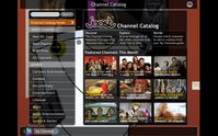
Joost is a video player application that streams on demand video directly to your computer and has a host of associated add to enhance the service including channel guide, search, video controls and interactive chat functionality.

The service itself is impressive; the streaming was of high quality with minimal service interruptions. The selection of content is good, especially given their new-ness, and the integration of services is clean and truly integrated. Having used other media services before I would cringe at clicking any of the buttons for fear they would launch an external window, but to my amazement all the features tested were integrated in to the display.

In order for software, or any system of that matter, to do something new the user must pass the gulf of execution, which in simple terms is the user must bring their level of knowledge up the level needed to use a product, or the product needs to bring its level down to the user. Icons are a common area where the user knowledge and product knowledge sometimes miss each other.

A clean interface where icons have become part of a user’s understanding such as a stop sign or play button are easy, other icons to represent more difficult concepts usually confuse users. Relating to Joost, there are several icons that are difficult for the user to decipher, because they are unique to the application. The hide all widgets icon is one of them. One of the ways Joost bridges this gap is to provide rollover text, so in time the user brings their level of understanding up to the product level.

Some icons however contain harder concepts, and as such require additional help. This is the case with the MyJoost and MyChannels options on either side of the player. For these the icons have been married to actual text.

One of the more interesting concepts in Joost is the chat functionality. In this I think Joost may have missed the mark. It is difficult to have a collective experience when everyone is not seeing the same thing at the same time, and I think they will find this function will get little actual use.

A better function may be more akin to Twitter, the microblogging service. Since the user controls the real-time why not let users peg comments to different parts of the stream, like a user commentary. This would allow for an interactive experience while avoiding the real-time viewing problems.

Integration with the stream is one of the nicest features of Joost, controls are presented in an overlay of the content, so users can multitask for shows or videos while they are watching. For this reason I understand why Joost would want their player to appear full screen when launched. This helps with the overall immersive experience; it does however limit a user’s ability to multitask outside of the product.

Overall Joost has provided a very user centric application. Now it’s time to go watch Action! With Jay Mohr (a great comic and frequent guest on Opie and Anthony and Ron and Fez), just one of the shows available on the service.

Check Joost out yourself. If you need an invite, post a comment and I’ll send you one.

Wednesday, May 9, 2007

The Usability of Office Cubicles


There is an interesting phenomenon that occurs in a corporate environment where occupants of a cubicle revert to pre-adolescently in regards to movement and sound. In this state the owner believes that since there are walls, parties on other sides of the walls cannot see nor hear the cubicle owner.

Cubicles give the owner the illusion of privacy, very much like good usability practices can give the illusion on speed and robustness where none exists. In application development if you include user prompts throughout the process the user remains informed, lessening the anxiety of not knowing what is going on. Using this illusion you “trick” the user into believing that a process is shorter than it actually is.

More recent academic studies have noted the disadvantages of the cubicle. While reducing the amount of noise and distractions in the office environment, the cubicle has reduced amount of person-to-person communication among office workers. While the removal of distraction is indicative of a straight through work process the lack of collaboration brings with it a stagnation of work processes. It is difficult to improve a process if there are no catalysts for improvement.

Cubicles have taken many shapes and sizes over the years and in many corporate environments the size and shape of a cubicle is directly related to your level in the organization with higher walls and even doors giving the illusion of an “office”. In some corporations cubicles that have collaborative team areas where there are no walls have been seen as a demotion for the occupants. In reality, these collaborative areas provide flexibility and a catalyst for creativity while providing an impromptu meeting space.

Tuesday, May 8, 2007

Usability of Parking Spaces

Most people don’t think a great deal about parking spaces except when they need one, and I’m positive that nobody thinks about how and why parking spaces work. I was one of them until I noticed when the affordances that designate how a parking space works breaks down.

Included is a photo of just such a breakdown. This is a commuter parking lot for the Long Island Rail Road, where the parking lot is over half full with the most desirable spots close to where the train entrances are filled. The spots you see however are not filled, and they are in a desirable location.

Before continuing, try and decipher why the spots are empty.

Parking has rules. You follow these rules and your car is safely tucked away for the day. If you break the rules, the car is ticketed or towed. Along with the basic stated rules such as “head in parking only” that are posted in the lot there less stated rules drivers learn, such as parking is allowed between lines. These lines enforce the direction and spacing of the lot. They are also meant to insure that there is adequate spacing between the cars for effective egress and entry.

Like most usability rules, you only notice them when they are broken, such as when a car parks too close (or over) the lines, or in this case where there are no lines at all.